


Ten years after the first alpha, dataseries.org is relaunched: 70 Swiss economic datasets in one place, with a new UI, a public API, and a scraping pipeline that is derived by AI from plain markdown files.
Ten years ago, I launched a first alpha version of dataseries.org, declaring:
This website aims to end my lifelong struggle with Swiss data.
Switzerland’s economic series are provided by many independent data providers. Consumer prices are collected by the Federal Statistical Office, quarterly GDP is computed by the SECO, and data on the balance of payments is surveyed by the Swiss National Bank. Finding data in Switzerland was always tedious.
Ten years later, a fully relaunched version of dataseries.org now pulls 70 economic datasets and makes them available in a single place. The catalog spans national accounts, prices, the labour market, money and banking, interest and exchange rates, the balance of payments, business sentiment, and population.
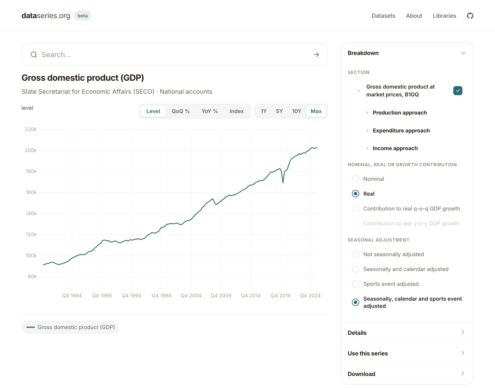
The idea was never the problem. But for the last ten years, data scraping was often hard and I lacked the time and resources to keep it up properly. So while I had some good data at times, without maintenance, datasets got stale.
The advent of AI has made this dramatically easier. The new beta version keeps the scraping logic in plain text markdown files, and the scraping code is derived by AI. The whole pipeline is public, in the cynkra/dataseries-data repository. This allowed me to include 70 public datasets, which is much more than what old dataseries ever had, and what should be a comprehensive set of Swiss economic data (if you miss some publicly available data, just ping me!).
The new scraping logic is monitored by a GitHub Action, so we can be confident this actually works. I have been measuring it daily for more than 2 months, and apart from a hiccup on day three, the process successfully completed every single day. Data providers sometimes go down, but this never led to stale data. I monitor the recentness of the data, so we can be confident that the most up to date data is shown for all 70 datasets, every day since I started the monitoring.
Together with the extended and improved data fetching comes a new UI and API. The UI is now a modern TypeScript web application that gets all its data through the public API. This is much faster and more stable than the older Shiny app.
The API is a plumber API and can be used standalone, or from almost any software. All endpoints are documented on an interactive API page. If you use R, you can conveniently access it through the updated dataseries R package from CRAN. You can also embed updated graphs either as iframes (with interactivity) or static SVGs that are automatically regenerated.
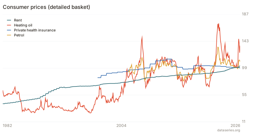
Four pieces of Swiss inflation: rents, petrol, heating oil and health insurance. The chart is regenerated from the API, so it updates itself as new data arrives. Open the interactive version to change the series, the transformation and the time range.
I will keep this in beta for another month. If all data stays green for 90 days, it is finally time for version 1.0.
Do you find this useful? Do you miss a dataset? Do you have ideas on how to improve this? Let me know!